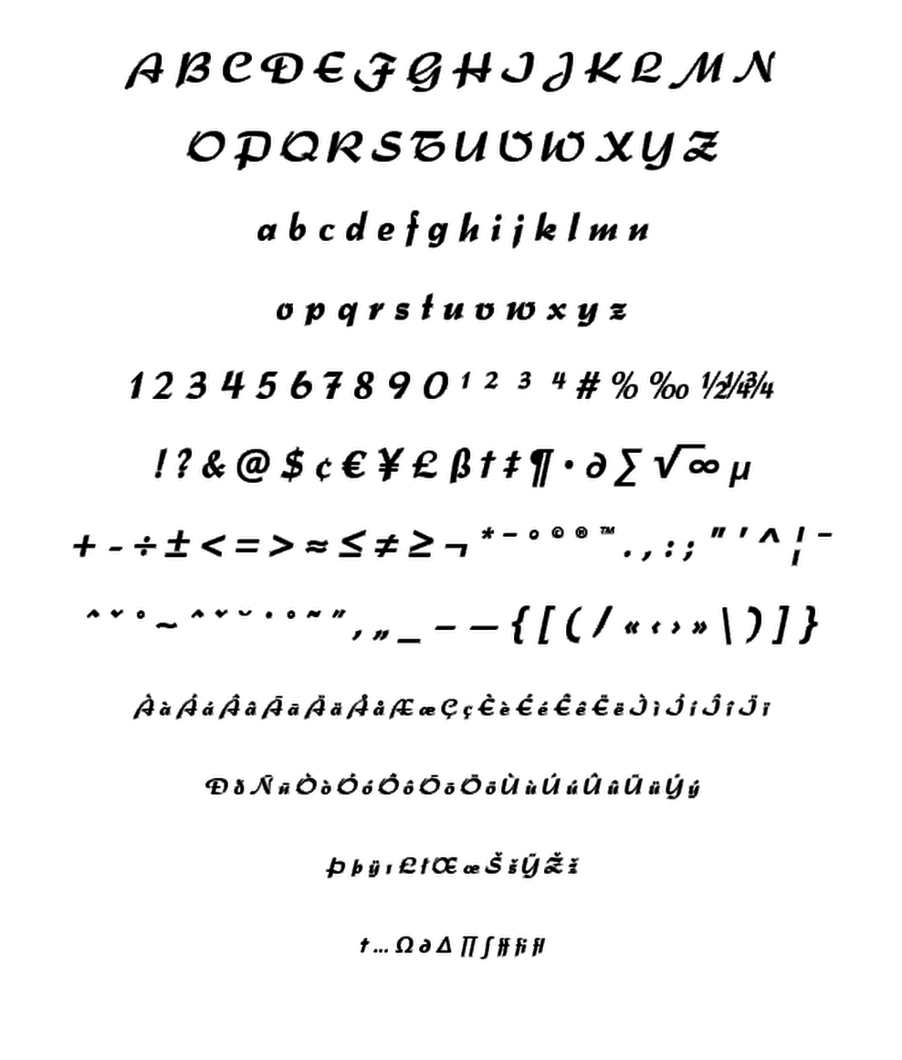
Originally, Splendor was produced and released in 1930 by Schriftguß AG, Dresden. The typeface was designed by Berlin designer Wilhelm Berg. Ralph M. Unger, who in the last few years has created a whole series of revivals and redesigns from the hot metal era, ‘retrieved’ this jewel of a typeface design, redesigning, complementing and digitally remastering it for profonts. Splendor is a broad nip, non-connecting handwriting script of timeless elegance, charme and beauty. It needs tight setting with plenty of space around it. The font contains a number of alternate characters: Two uppercase A's, S's (with descender); in addition, two uppercase M's, N's and Z's as well as two lowercase z's.
Typesetter


Billboard

