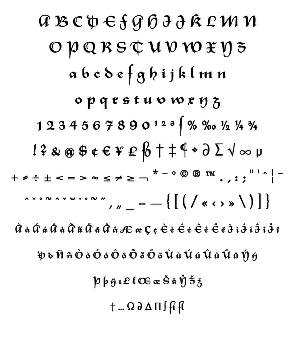
Rhapsody clearly shows Unger’s love with Blackletters and Gothics. In contrast to many existing Blackletters, Rhapsody is really easy to read. The calligraphic forms of the upper case combined with its lower case appear very special, very unique. Rhapsody, had its origins in the 50s, was redesigned, completed and expanded by Ralph M. Unger for profonts.
Typesetter


