FAMILY SYNOPSIS
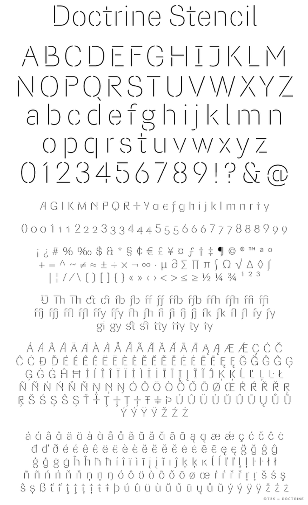
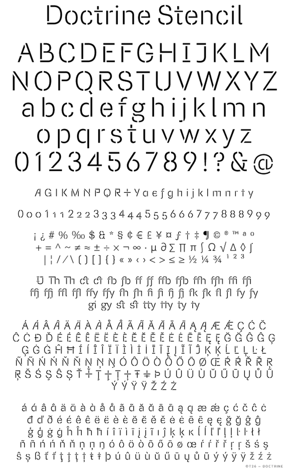
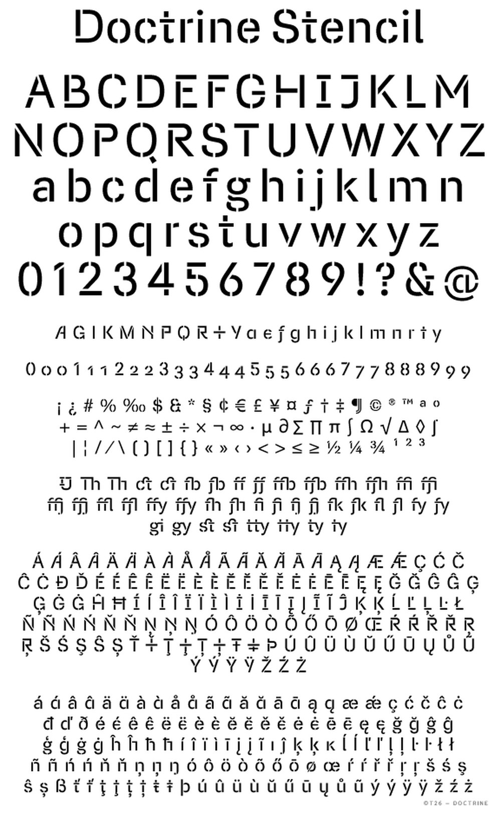
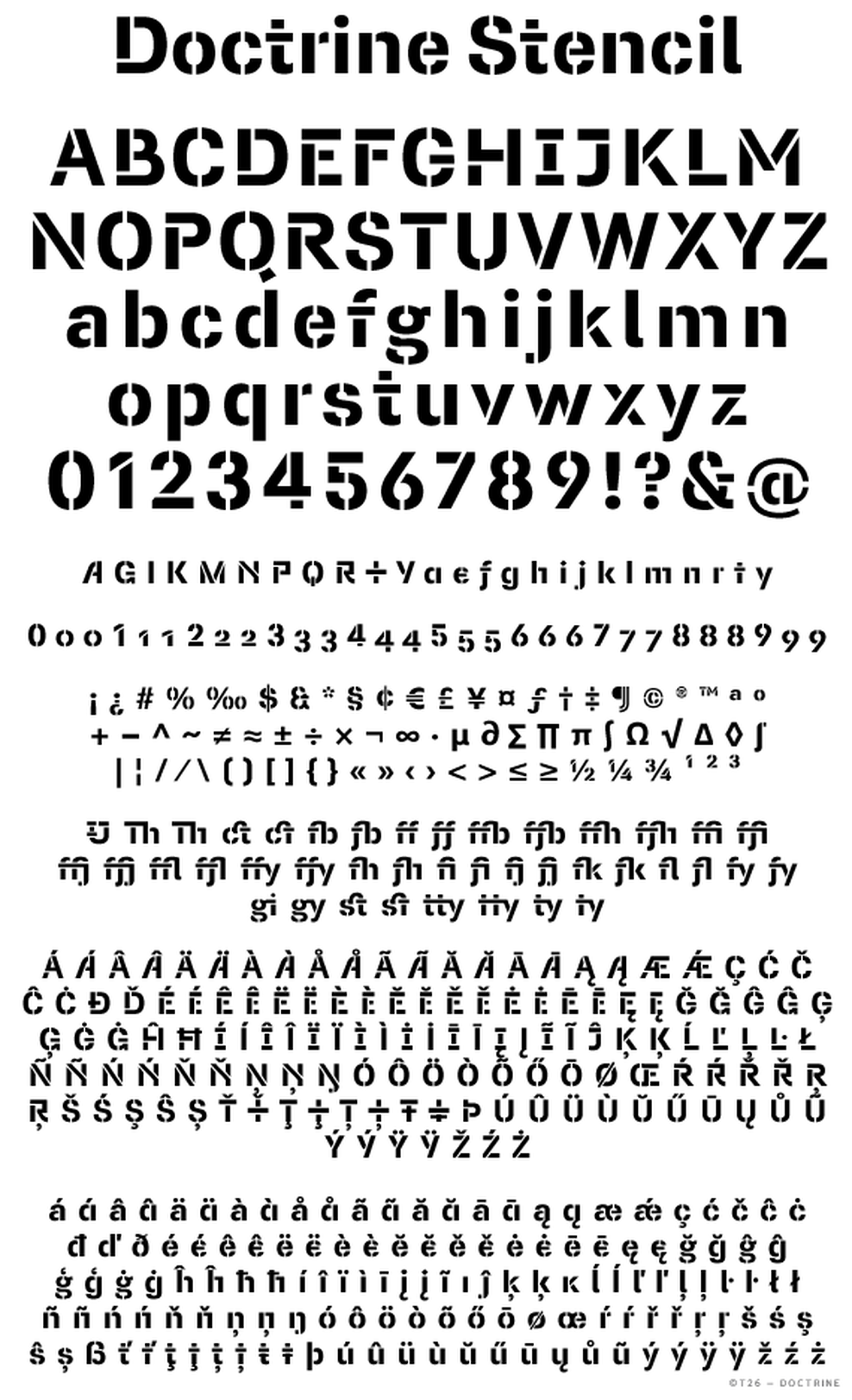
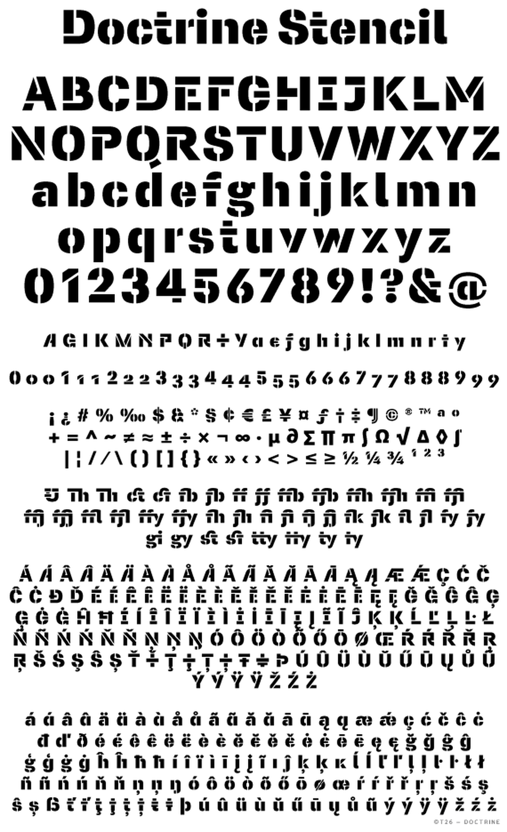
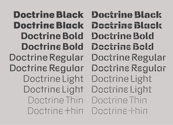
Doctrine is a sans-serif family which includes an agreeable text face and a more muscular stencil display face. From the obscure starting point of the North Korean national airline livery, Doctrine has grown to encompass a series of more mature typographic influences. By blending elements of twentieth-century neo-grotesque, humanist and geometric styles, Doctrine is at once universal and idiosyncratic. Including a vast array of ligatures and alternate characters in five weights ranging from thin to black, Doctrine is capable of handling a multitude of testing typographical situations.
CONCEPTUAL BACKGROUND
VirusFonts has long been interested in the link between ideology, language and typography, and it is this concept that inspired the creation of a new typeface. Following an extreme isolationist and authoritarian ideology, North Korea – the world’s last Stalinist state – affords its population little freedom of movement. Considered by many to be a fundamental human right, air travel facilitates freedom of mobility between states. Air Koryo, the state-owned national flag carrier airline of North Korea, therefore appears to be somewhat of an oxymoron. With an unsurprisingly dubious safety record and dismal reviews, Air Koryo is not held in high regard, yet there is something wonderfully naive about its attempt to look like a serious airline. Central to this venture is its rudimentary aircraft livery and branding – often crude in application and at times, even looking hand-painted. Once taking the form of a functional stencil typeface, the logo has now metamorphosed into a modern sans-serif. This peculiar conceptual mix – part political philosophy, part corporate branding – inspired the development of a contemporary, human interpretation of the neo-grotesque model, that most ideological of typographic forms.
DESIGN INFORMATION / ABOUT / TYPOGRAPHIC REFERENCE
Escaping beyond the conceptual, political and historical starting points, numerous typographic references have informed the framework of Doctrine. Inspired by mid-twentieth-century modernist idealism but guided by post-modern relativism, Doctrine has evolved into a twenty-first century utopian sans-serif. Pursuit of utopian perfection suggests a purity, or purification — an eradication of extraneous detail — yet, in contrast, the ideology of Doctrine is one of inclusion. The inclusive approach allows a curious blend of modernist, geometric and humanist forms to coalesce in contemporary style.
The basic structure of Doctrine was informed by the neo-grotesque model, notably Adrian Frutiger’s masterpiece Univers and Max Miedinger’s ubiquitous Helvetica – the behemoths of mid-twentieth-century modernism. Yet unlike the aforementioned faces, Doctrine is less clinical and more human in appearance. The rounded, lighter weights speak with graceful composure whilst the large x-height, low contrast and squarer, heavier weights give Doctrine an affable charm and a persuasive voice.
A number of characters draw inspiration from Edward Johnston’s influential humanist sans-serif for the London underground, adding a pre-modern benevolence to the primary character set and a quirky geometry to the stylistic alternates. Paul Renner's experimental drawings for his visionary Futura provided inspiration for the some of the unusual alternates, as well influencing the more conventional geometric forms.
Adding a playful note to headlines, the alternate capitals drawn on a diverse range of sources. The asymmetric A directly references the Air Koryo livery. Informed by the modular widths of geometric typefaces, the E and F are included with reduced widths. Also influenced by geometrics are the primary G and Q, their respective alternates are based on the grotesque model, as are the alternate M and primary K. The unusual R includes a concave leg reminiscent of Venetian serif faces whilst the Y is based on the Cyrillic character У.
In a nod to typographic history, Doctrine includes a multitude of ligatures. The move away from moveable type saw a steady decline in the typesetting of ligatures. Now, however, contemporary OpenType technology allows for an almost limitless number of glyphs, meaning ligatures can be revived and reconsidered for the twenty-first century, bringing a curious flair to body and headline text setting.
Delving deeper into typographic history, Doctrine features historical forms and alternate characters derived from foreign alphabets. That now unused but well-known historical minuscule, the long s, fell out of use in the early nineteenth century but is revived to work with Doctrine’s contemporary forms. Traditionally the long s occurred in the middle or at the beginning of a word – the most famous example being the in the word congreſs in the United States Bill of Rights. From the foreign alphabets, the lowercase e is inspired by epsilon, the fifth letter of the Greek alphabet and a precursor to the latin e, and the alternate f is inspired by the hooked f, the italic form of which, ƒ, is used to signify currencies named florin.
Facilitating distinction between the numeral 1, uppercase I and lowercase l, the primary character set includes a foot serif for the lowercase l, a serifed I and an armed figure 1. For a more compact and bold headline, the alternate uppercase I can be used.
Doctrine includes four figure styles, two proportional (variable width) styles and two tabular (fixed width). The default figure style is proportional lining – full cap height figures that work best with all-caps settings. Oldstyle figures are designed with ascenders and descenders and have proportions compatible with the lowercase characters for minimal disruption when setting body text. For setting numbers in tables, both lining and old style tabular figures are included.


